

PROCESS
Design at York U Promotion
Collage Exercise


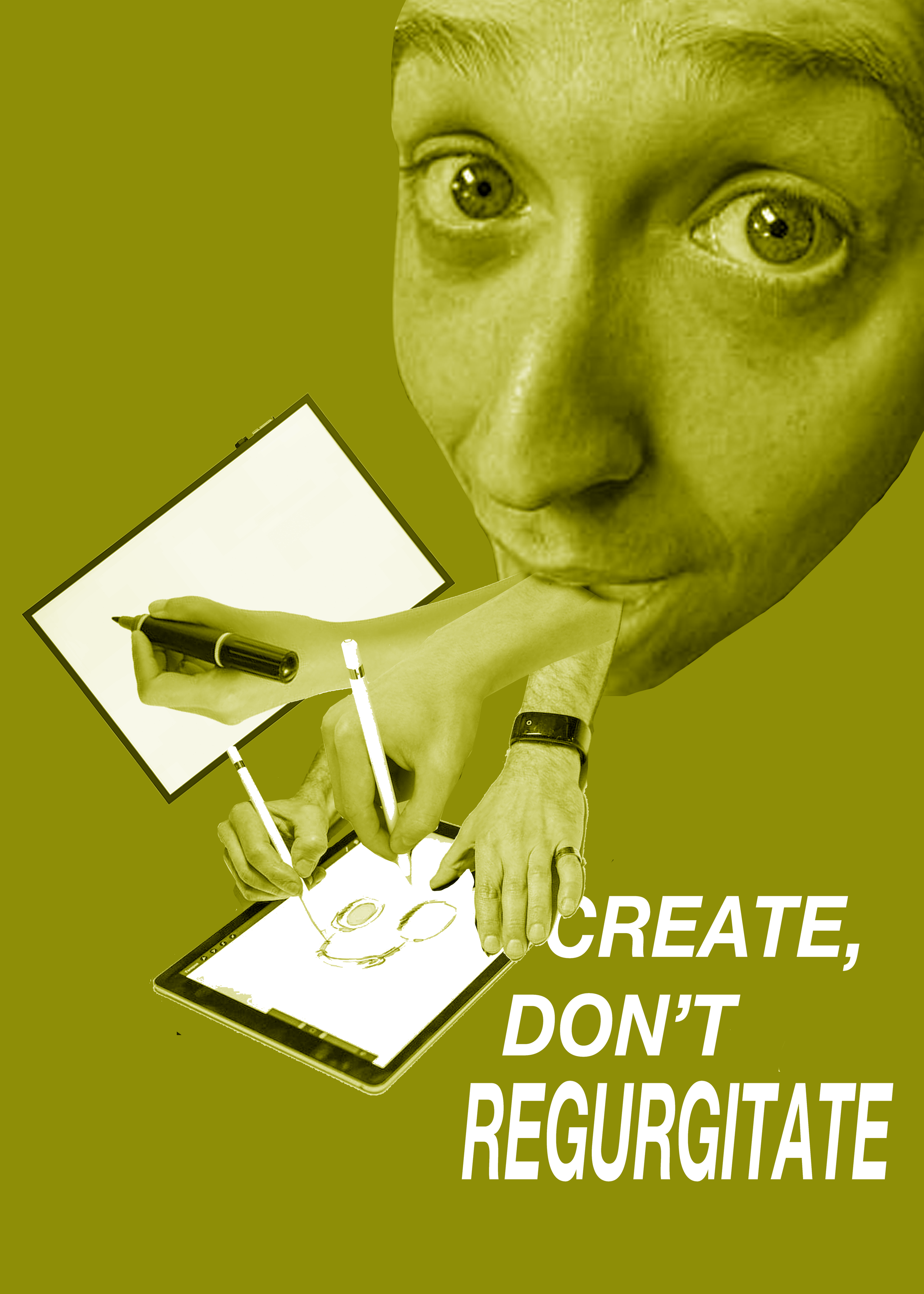
For a class exercise, I did a collage showing hands holding different art tools all being regurgitated out of a
person’s mouth. I like the clarity of the connection between the image and the tagline, but I can’t help but feel
that the overall look is a bit gross. That being said, I like this direction.


I took my collage imagery and tested out different illustration styles. I still prefer an all-photo look, but I don’t
like the idea of having all of my imagery come from elsewhere. I also sketched some simplified compositions
that have only one hand instead of several, but it somehow looks even grosser.
Sketches


My favourite idea that I came up with was having each hand interact with the title in
a different, design-related way - mouse, touch-screen, Apple Pencil.


Another possibility was to take inspiration from the 3 different design fields; one
for each postcard. Coming up with associated imagery was tricky.


When trying to make collages based on my 3 branches idea, I had a
very hard time finding arm photos that felt at all design related
(and the ones that I did find were of low quality). The inconsistent shadows in the photos are not masked by the
monochromatic treatment.
Version #1
Version #2


I felt that I needed to pivot. Since I have always had a bit of a
problem with the weirdness of having real human arms coming out
a person’s mouth, I thought about replacing the arms with
something else.
As I played around in Photoshop, I was drawn to the idea of capturing the process of
creating a design in my actual design (ex. Select tools, grids, highlighted text…).
However, I don’t think that I will commit to such a loose and subjective concept (it would
likely not appeal to most people).


