PROCESS
Modular Branding for Online Thrift Store
Logo Sketches


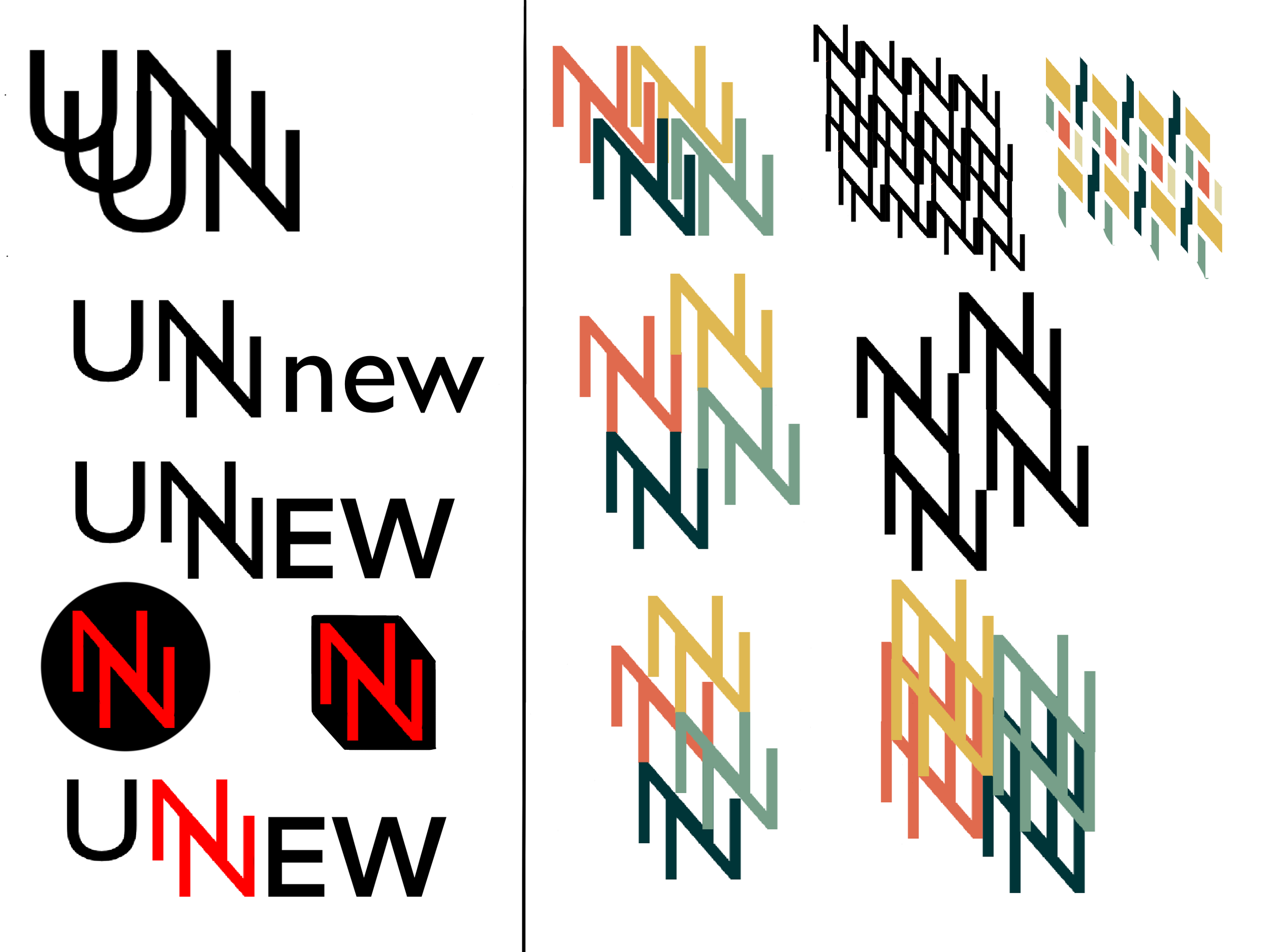
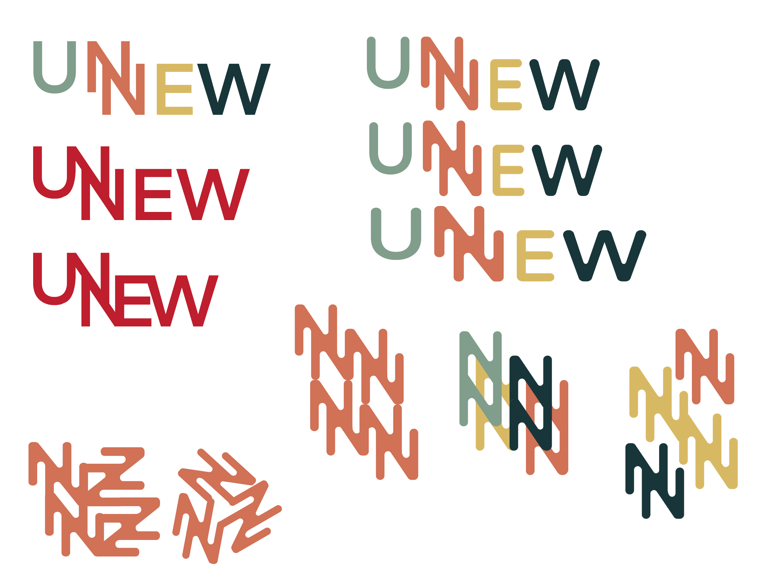
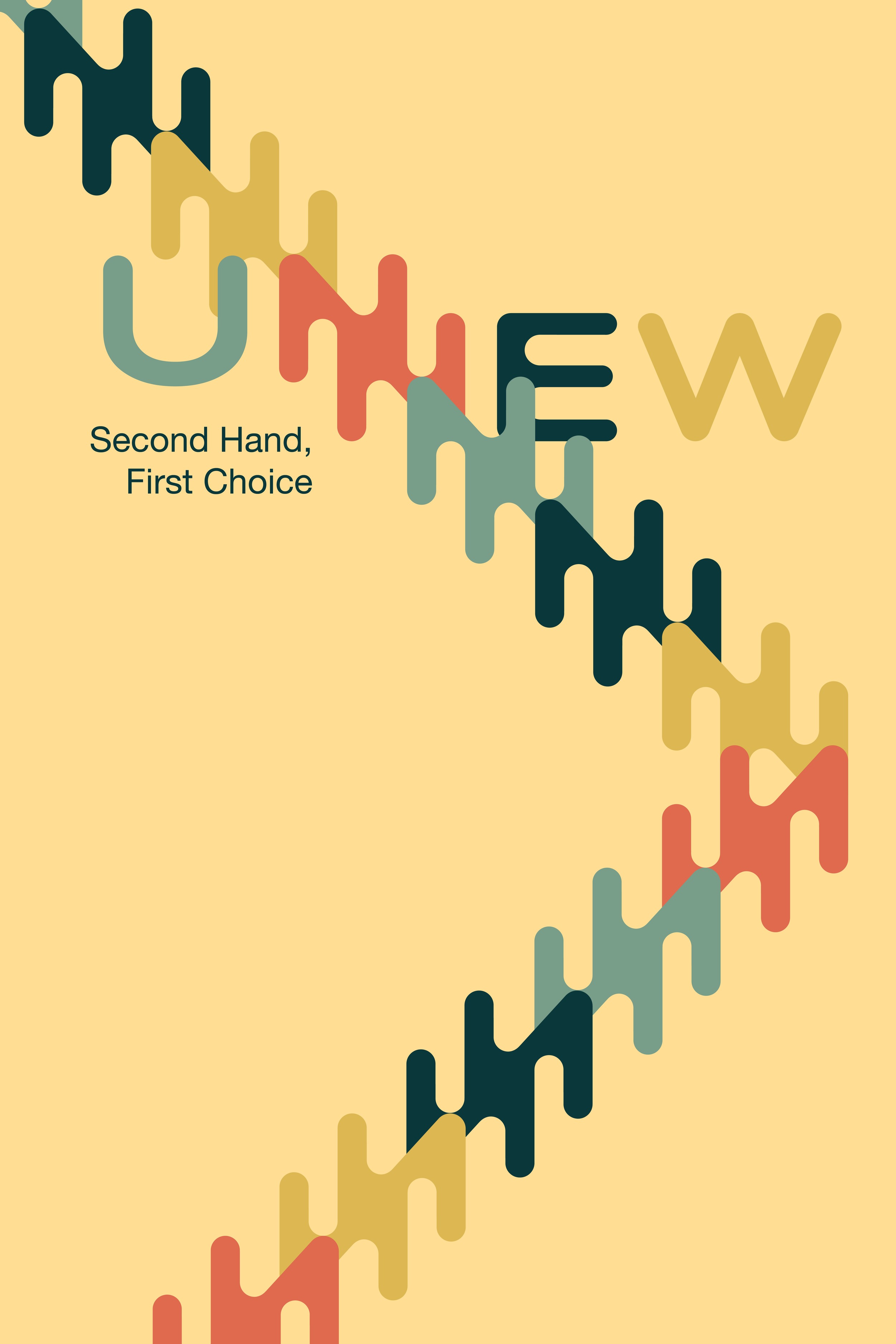
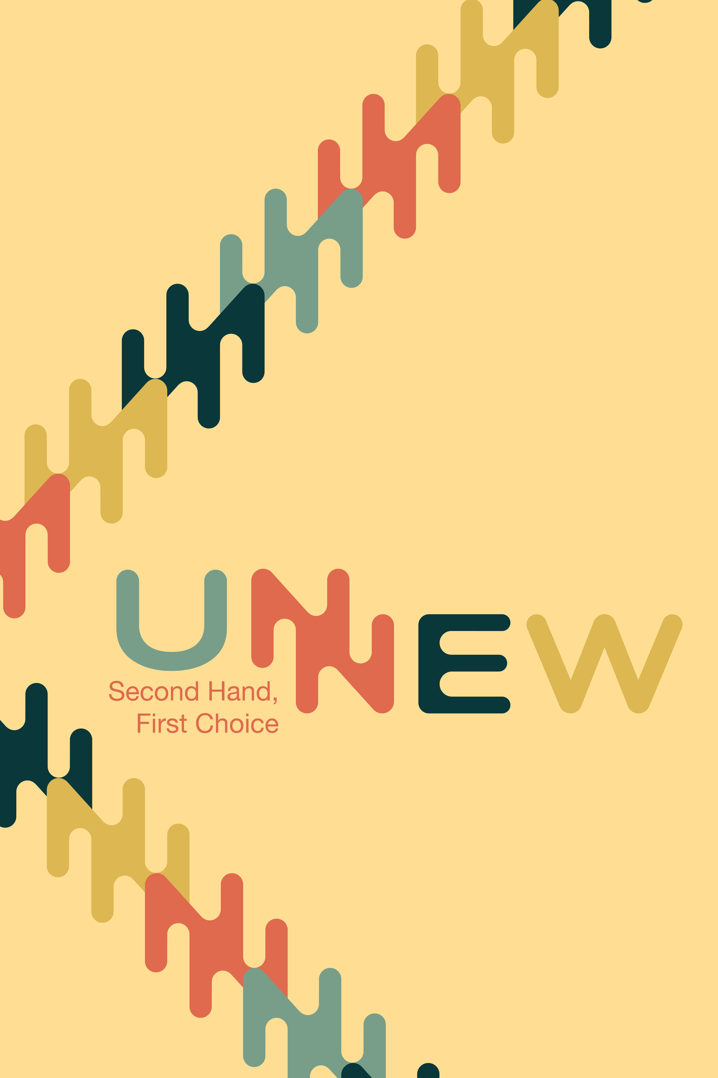
I aimed to create patterns using the double 'NN,' but the lines were too harsh and rigid, giving the design a serious tone. None of the typefaces I found were perfectly square, and the more uniform the weight and size of the letters, the easier it would be to form patterns.
I manually adjusted the design, rounding the edges to create a more welcoming feel and increasing the letter width for better balance.
Tote Bag Mock-ups
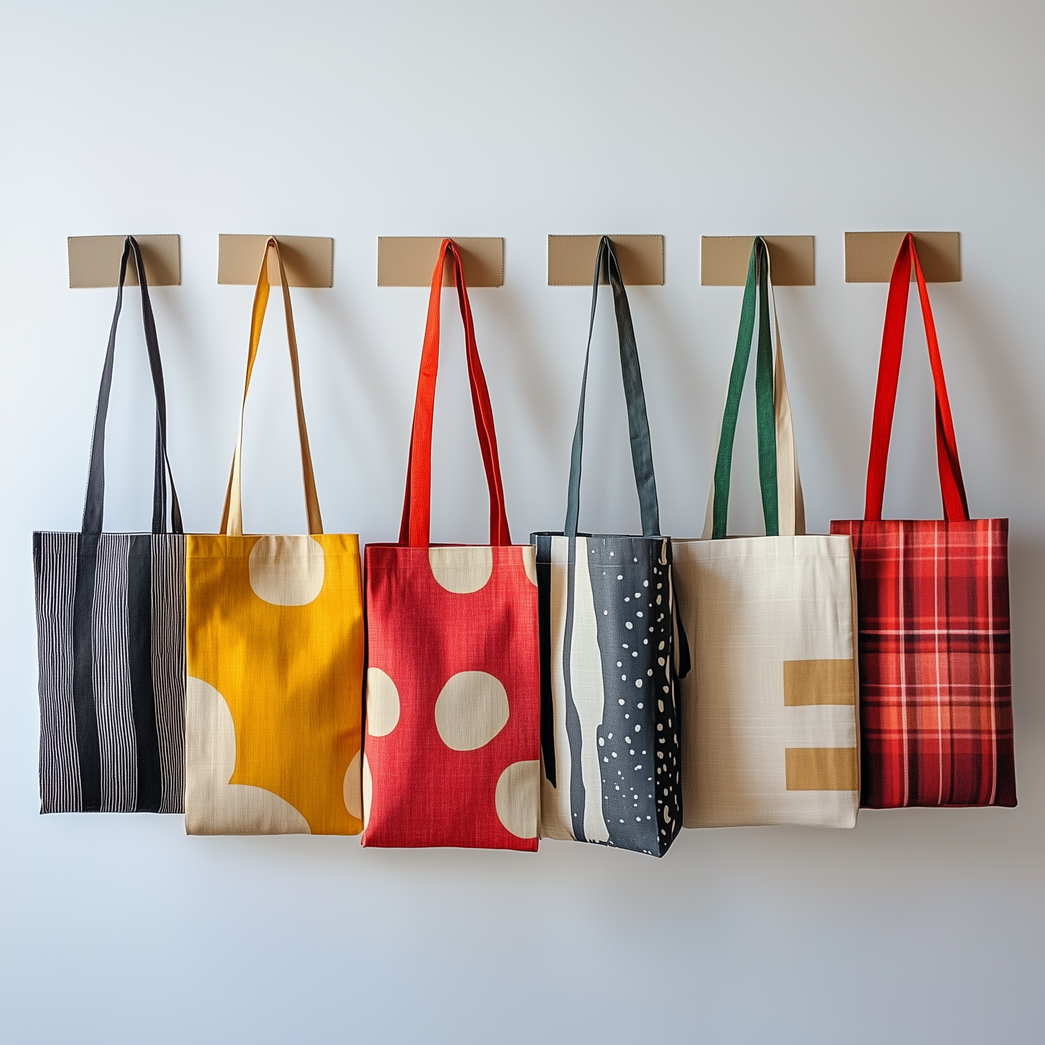
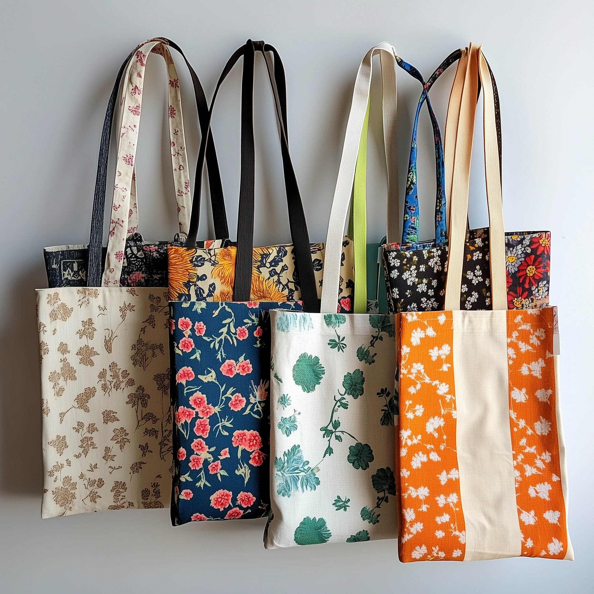
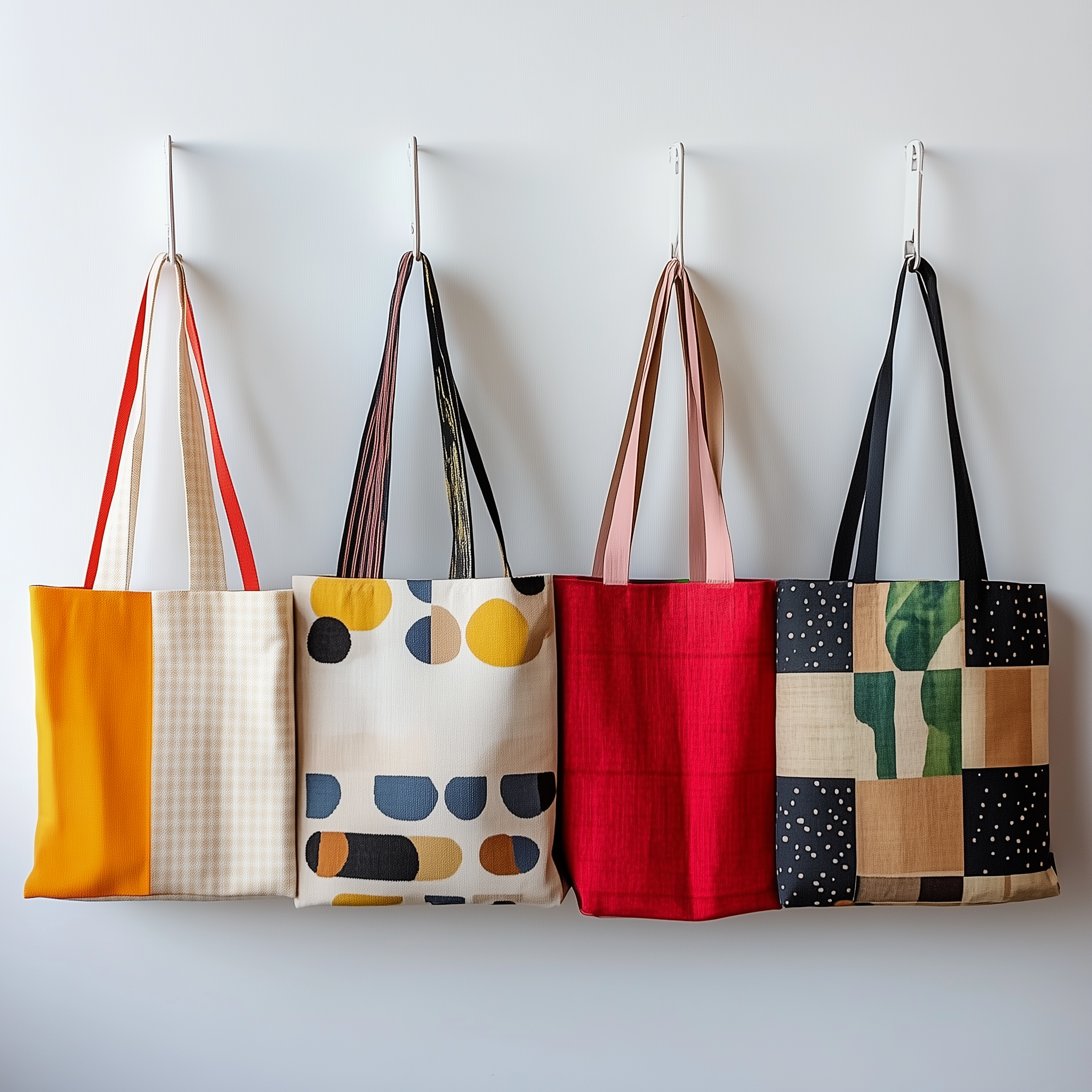
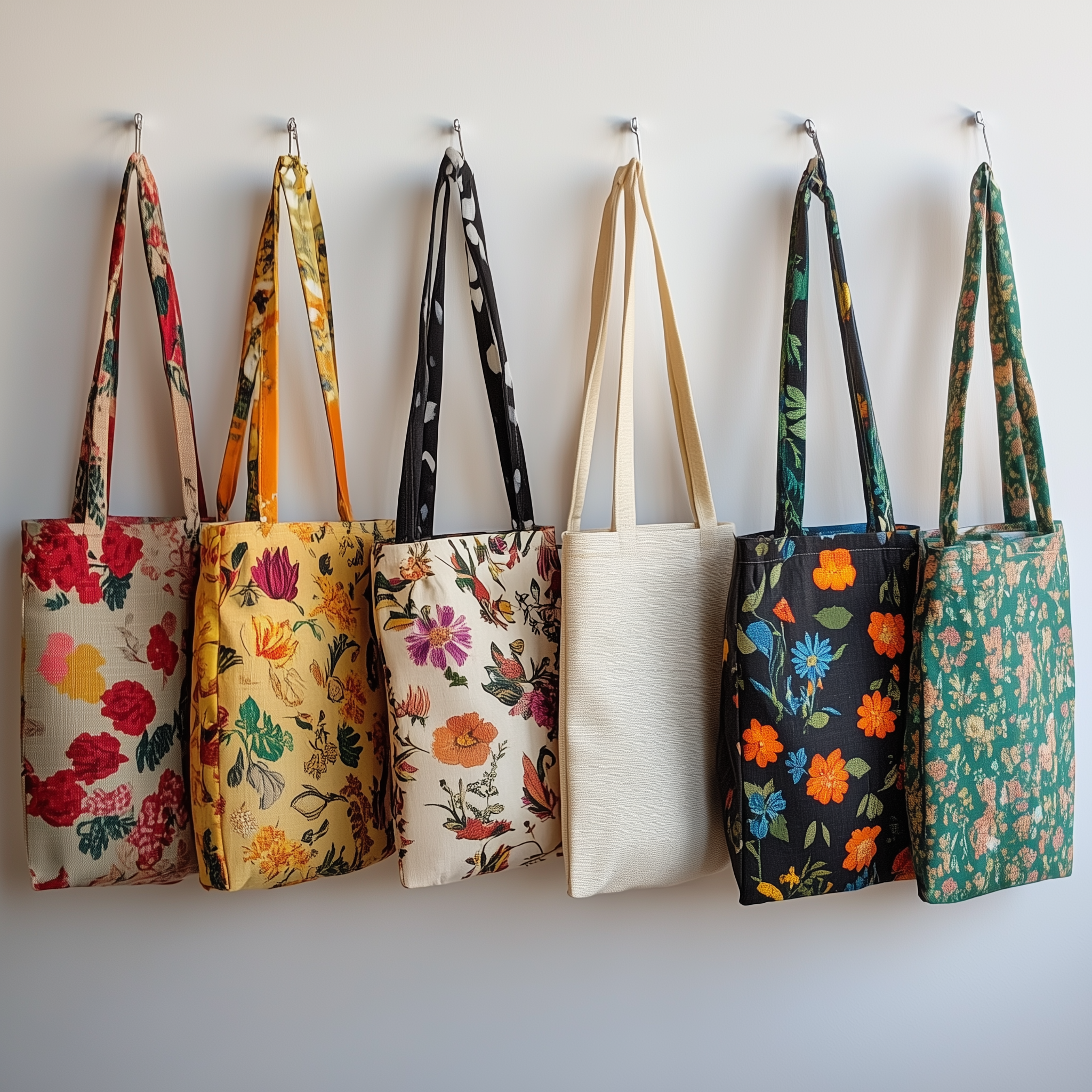
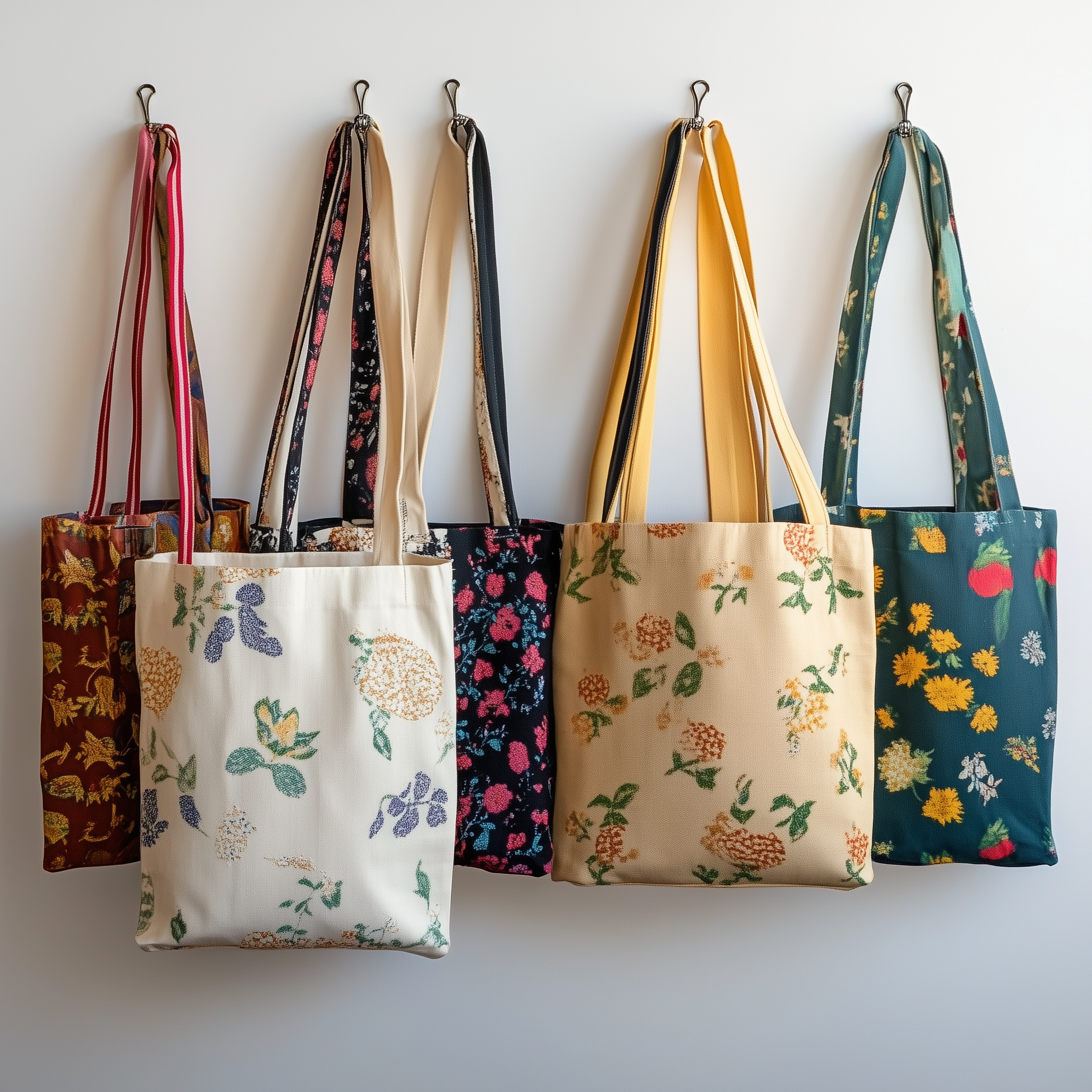
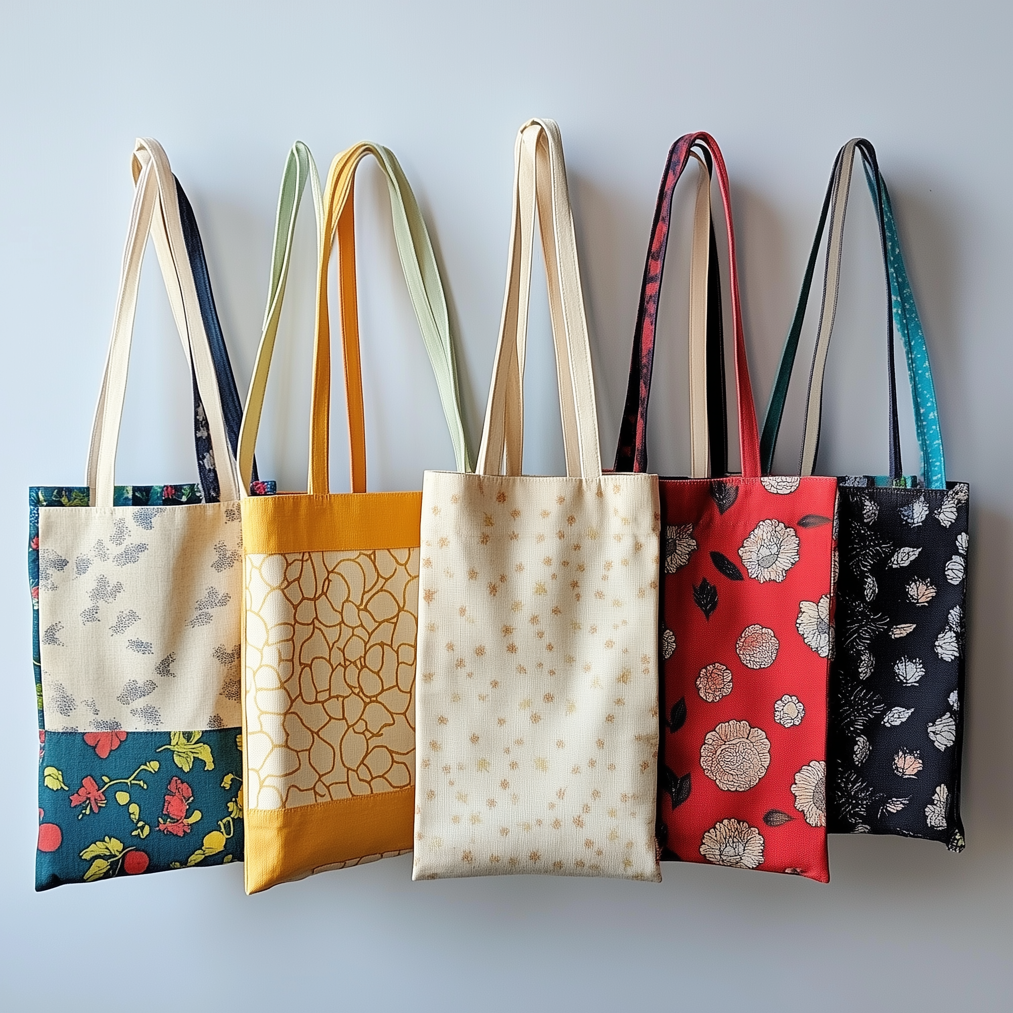
In Midjourney, I experimented with various prompts and images to bring my vision of a bag made from a patchwork of old clothing materials to life. It took a lot of tweaking, as many of the results missed the patchwork effect, and the textures and patterns of the fabrics often appeared too cohesive, modern, or busy, making it difficult to incorporate the logos I wanted.
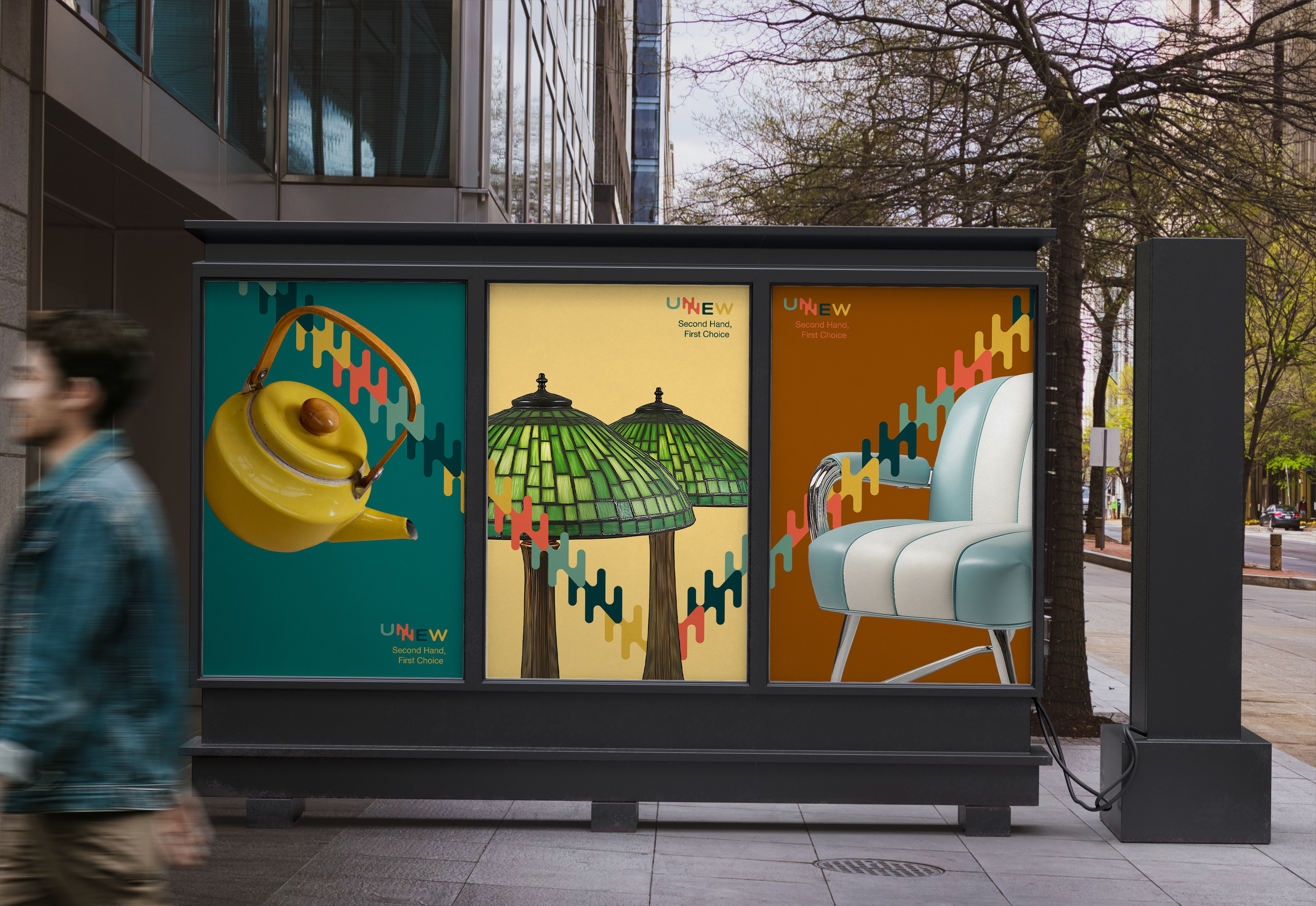
Poster Idea #1
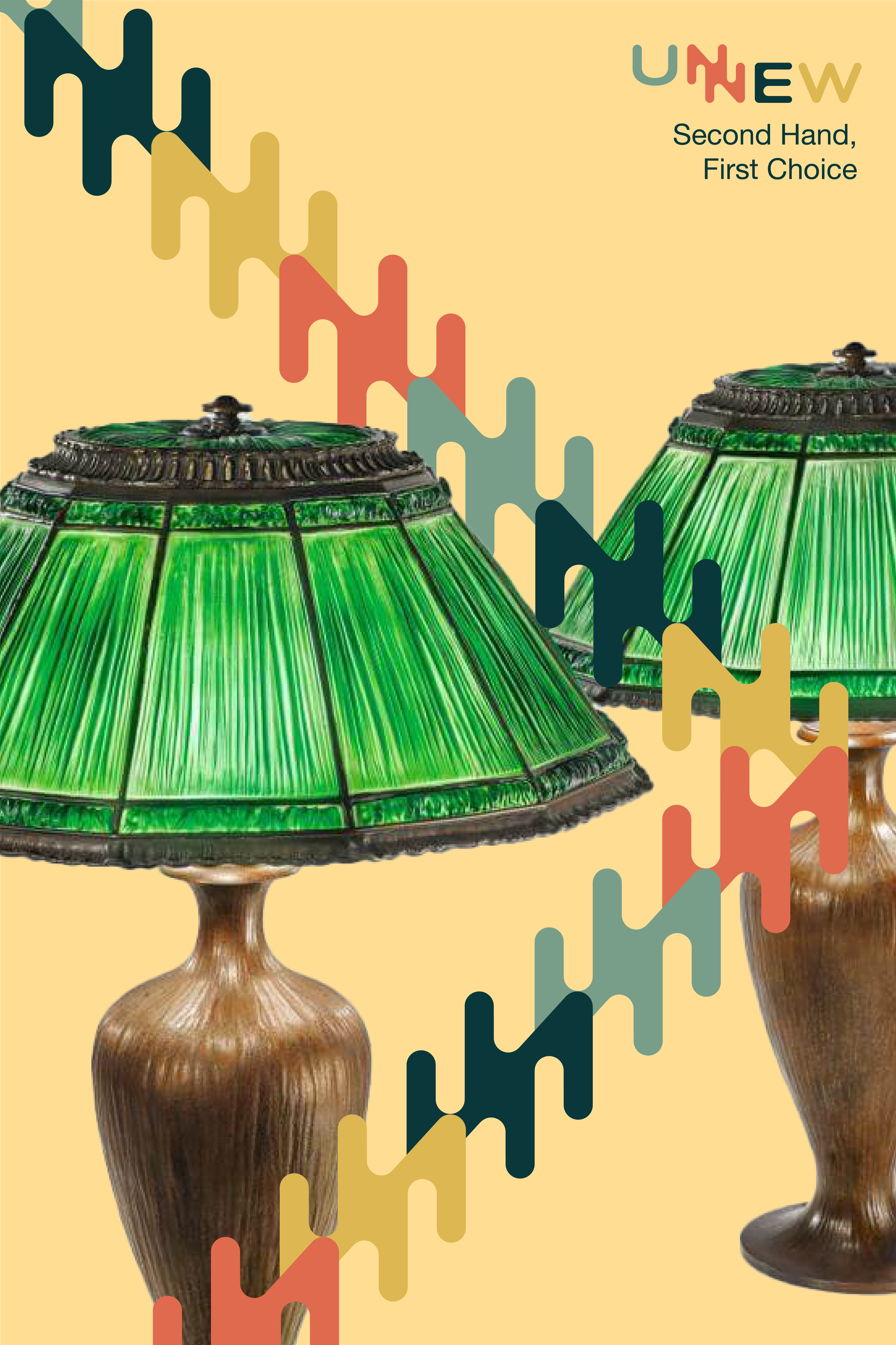
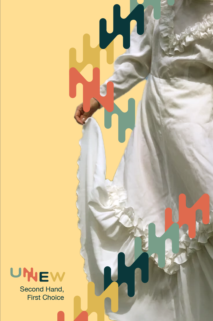
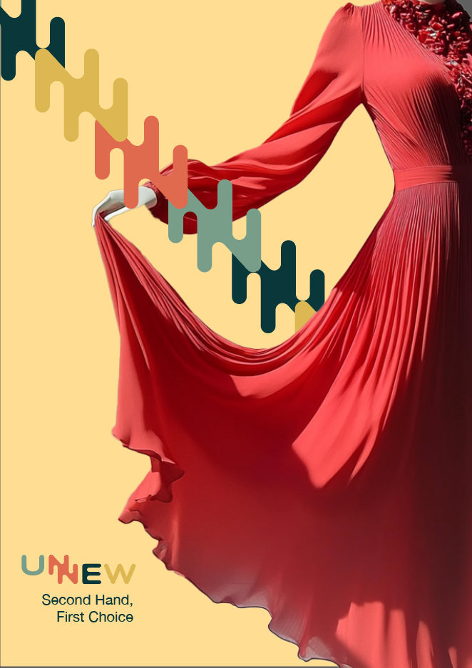
It was a challenge to find and create images that offered the best opportunities for the 'NN' lines to interact with the visuals—such as passing under an arm or weaving between lamps.
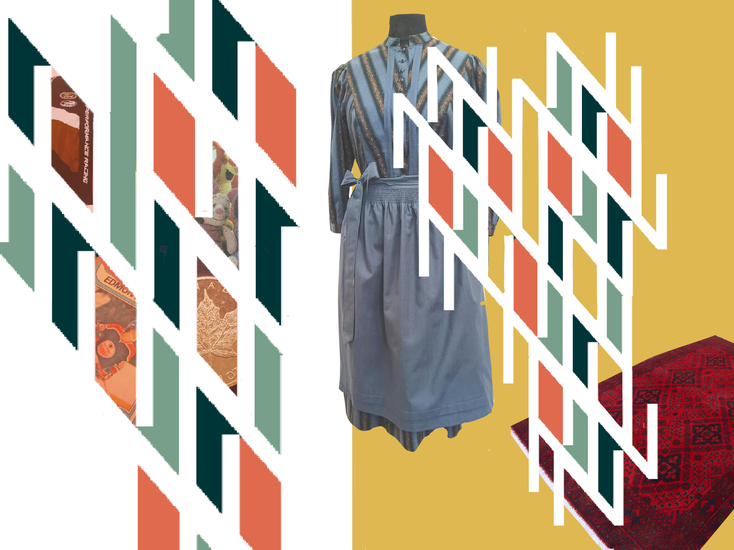
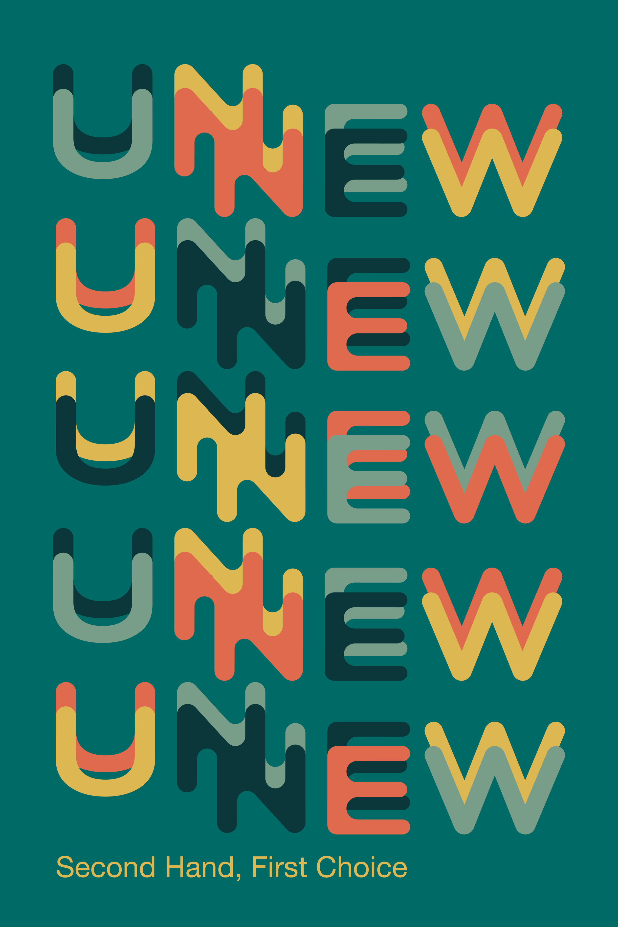
Poster Idea #2


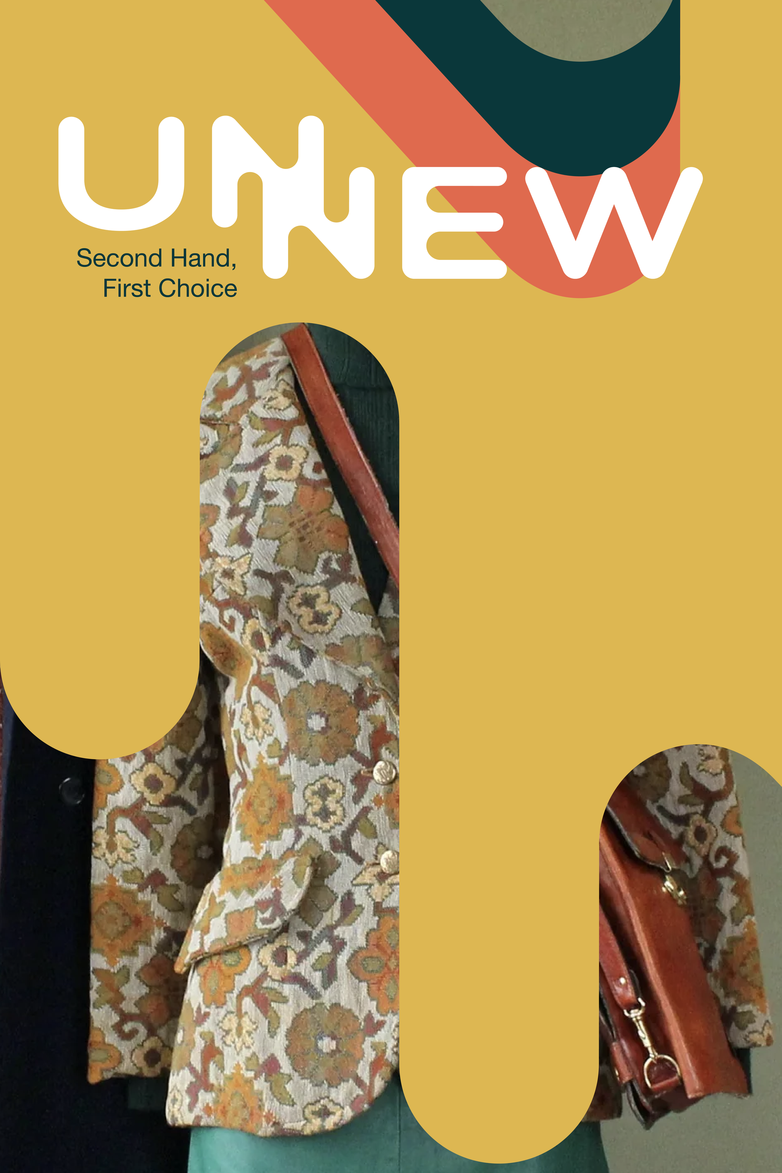
I wanted to introduce variety to my ad campaign by contrasting Poster Idea #1, enlarging the ‘NN’ motif to fill the frame. However, this disrupted the balance of the composition when I added images, causing them to compete for visual dominance. Ultimately, I decided to remove the images in the final designs to restore harmony.
Poster Idea #3


Poster Idea #4

Poster Idea #5